Located on the third floor of W Osaka, restaurant Oh.lala… offers an all-day international dining experience for its W guests, in collaboration with the chef of Michelin-star restaurant La Cime. Concrete’s local insight of the Japanese Love for French lifestyle & culture formed the inspiration for this bistro-diner. A French atmosphere combined with Osaka boldness: Oh.lala…
French cuisine is a favourite in Japan and the main inspiration behind the overall concept of Oh.lala… The interior design draws its inspiration from traditional French cuisine’s copper pots and pans, as well as the typical Breton shirt. Its blue and white stripes have been changed shape into the hotel’s characteristic circles and zigzags.

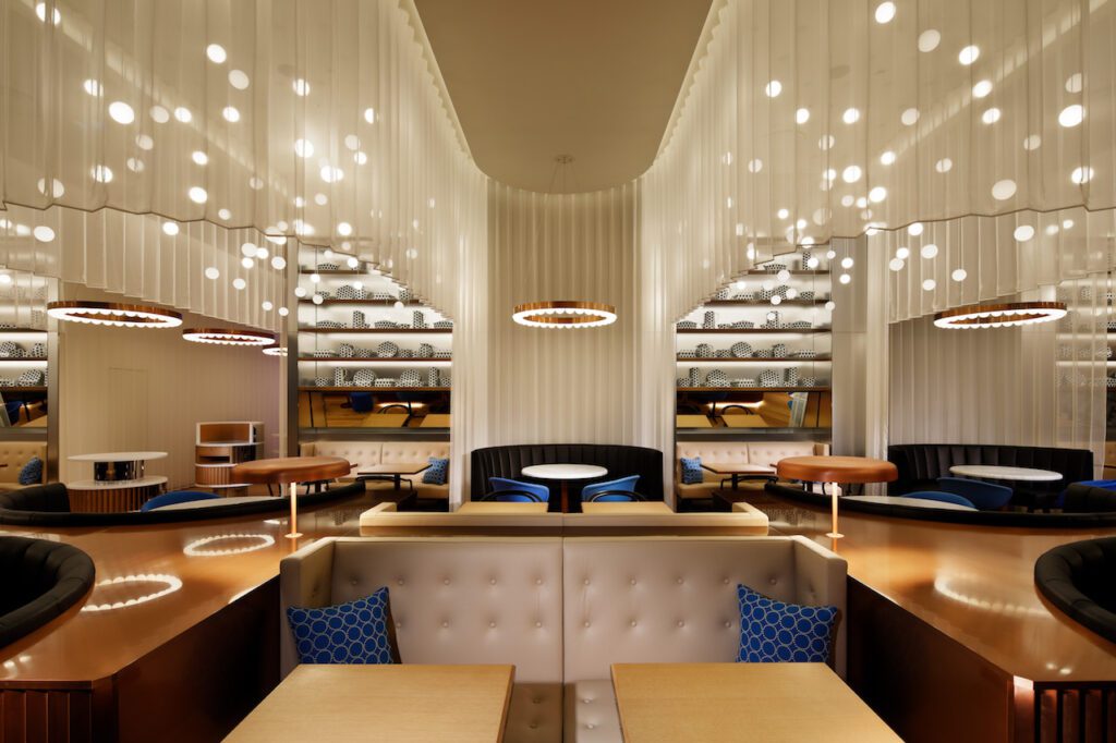
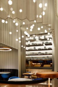
Guests enter from a hallway lined with zigzag-curtains, as the oak plank flooring shifts into a chevron pattern. The sheer curtain rises and falls, curving intimately around booths and tables, which merge together into a modern take on the traditional, shared brasserie dinner table, clad in copper-toned metal. Seating is also found along the windows and in niches along the back wall, with sofas alternating in black and white leather and tabletops alternating in white marble and oak on copper stands. Along the wall are tilted mirrors, for an extra opportunity to people watch. And above all that, stainless steel shelves are styled with unique porcelain objects decorated in blue dots – combining traditional French shapes and colours with the boldness of Osaka.

Adding sparkle from above are clouds of small glass pendant lights, suspended at different heights within the waves of the curtain. Between these clouds, copper-toned chandeliers offer subtle downlighting.
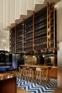
The aperitif bar is also defined by blue and white chevron tiles and clad in stainless steel. A high table can double as guest seating or serve as a bar. The open shelves are filled with bottle after bottle of exclusive W Osaka Champagne!
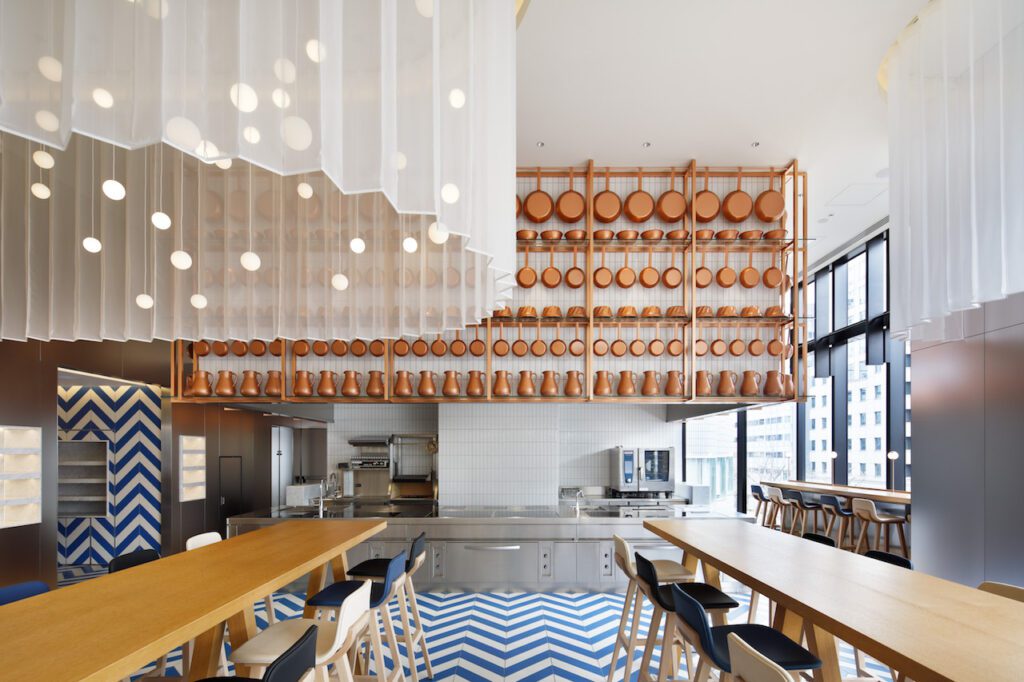
Completely opposite the aperitif bar is the open kitchen – designed using the same style. Above is a wall of rectangular white tiles with a handmade look, much like those used in the streets of Osaka. In front, a copper frame holding copper-coloured pots, pans and other objects that enhance the French atmosphere.
Dinner guests get a front-row seat to the chef at work at high, communal oak tables. Buffet-style meals can also be set up here – with direct access to the cold kitchen, seamlessly clad floor-to-ceiling in the same Breton styled tiling.

To make the French dining experience complete, the graphic identity of restaurant Oh.lala… combines French elegance with the playfulness of Osaka. The logo consists of a bright & friendly handwritten font, with the capital O and dots forming perfect circles.

The colour blue is based on the typical Breton stripe and in line with the colours of the interior design. A neon version is placed at the entrance, inspired by the vibrant streets of Osaka. The blue and white stripes of the typical Breton shirt are translated into a pattern of perfect Japanese circles – with one outlined circle adding a touch of playfulness.

This Japanese dot pattern forms the base of the graphic design of the restaurant menus, business cards, stationery and coasters. The pattern can also be found on the porcelain styling objects in the cabinets and table decoration such as napkins & coasters.

Publisher of Hospitality and Leisure News, 365 Retail, Retail Source and organiser of the Creative Retail Awards.


