Every W hotel is designed for its specific location – with foreign designers invited to offer the fresh perspectives of an outsider. For W’s first hotel in Japan, Sekisui House and Marriott International called on Amsterdam’s Concrete Architectural Associates – challenging designers from one of Europe’s most famous harbour cities to discover inspiration in an ancient harbour city on the other side of the world.
The sprawling metropolis of Osaka was once the imperial capital of Japan and the country’s economic hub. At its heart, the wide Yodo River flows into a harbour bustling with trade. Throughout its history, visitors contributed their cultures and technologies to the city – creating a prosperous port with an extroverted, lively and somewhat rebellious culture. All of this energy attracts international businesses and visitors.
-
w osaka by concrete
Concrete’s team of Dutch designers explored Osaka’s past, present and future, its urban and natural landscapes, and its fascinating culture. Visually, they discovered that Osaka is water and nature – but also neon and bright colours. They were struck by the contrast between the aesthetic of Japanese minimalism and the extravagance of an urban world saturated with colours. Especially in downtown Osaka and Dotonbori – Osaka’s nightlife district – the display of flashing neon is breathtakingly vivid and joyful.
Then there’s the simple beauty of nature. The pink of the much-loved cherry blossoms and the golden yellow of the ginkgo trees in autumn – which line Midōsuji Boulevard, where W Osaka is located.
The goal was to share the spirit of the city with the guests of W Osaka. And let the interior of the hotel tell a story that is truly Osaka. Celebrating the opposing – yet complementary – forces of extravagance and simplicity.
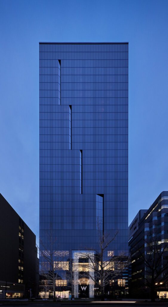
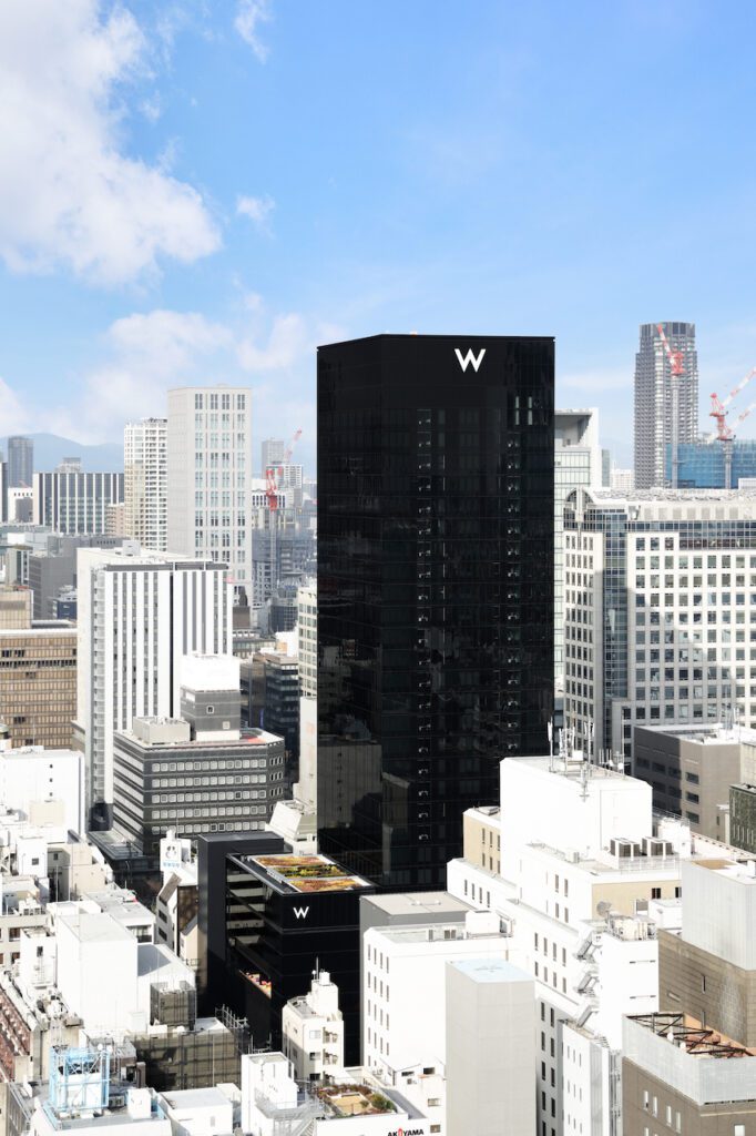
Two forms of signage are used on the W Osaka façade. At the top of the building, a 3-meter tall W is backlit in warm white, and serves as a simple beacon and city landmark. In keeping with the Japanese custom of celebrating seasons, the RGB backlighting can change colours to reflect the seasonal colours used in the lighting within the hotel.
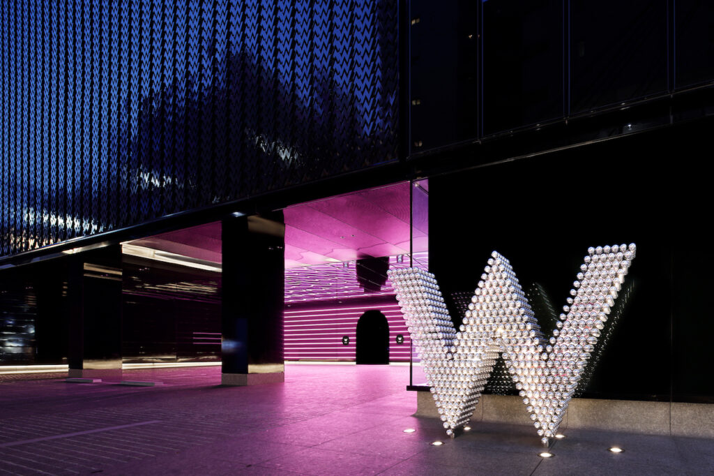
Mounted above the main entrance, and positioned at street level by the entrance of the porte cochere, an iconic W is made of hundreds of perfectly round and shiny chrome balls – designed as an eye-catcher, reflecting all the shapes and colours around them.
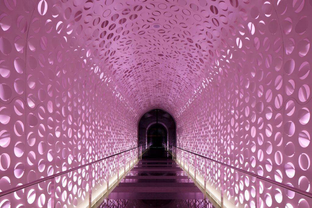
The “wow” experience begins as you enter the long arrival tunnel from the main Midōsuji Boulevard entrance. Inspired by delicate blossoms and the fine art of origami, more than 3000 circles were laser cut into sturdy metal and folded randomly – creating an otherworldly portal into the world of W Osaka.
The white powder-coated metal is backlit with RGB LED lighting that changes colours with the 4 seasons – pink, blue, golden, purple – and shift in intensity from daytime to night. A warm, white uplight along the grey granite floor adds playful shadowing. A shorter version of the tunnel runs from the porte couchere, where a wall of horizontal neon glows in corresponding colours.
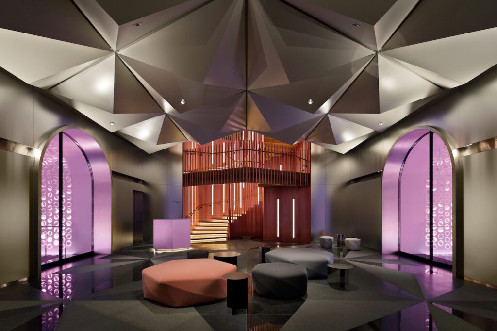
At the end of the tunnel is the arrival lobby, where lifts whisk visitors up to the 3rd floor for check-in, and to the spa level on the 4th floor. An iconic staircase leads to the 2nd floor and the hotel’s function and meeting rooms.
Here, the asanoha pattern was the inspiration behind the ceiling, flooring and staircase. A simple yet bold ceiling uses a blown-up, 3D version of this traditional geometric pattern – which is reflected in the pattern on the granite flooring, in 6 shades of black and dark grey. Colours and shapes are softly reflected in the satin stainless steel walls.
Building further on the asanoha pattern, the staircase to the 2nd floor derives from this hexagonal shape, when viewed from above. The traditional oak steps contrast with sakura pink metal tubes, which sweep upwards, cladding the interior of the staircase and forming the handrail.

A floor with many functions – from check-in to dining – the 3rd floor is characterized by classic oak floors and one continuous white, sheer curtain with sharp origami-style pleats.
Like an endless shoji screen, it flows from here to there and around again, to connect and separate the spaces that serve W Osaka’s guests. At times, the curtain covers a wall – other times it hangs freely to define a room. It’s cut to reveal windows and lifts – and to create access to the bar. Round spaces form a gentle contrast to the hard edges of the zigzagged fabric and walls.
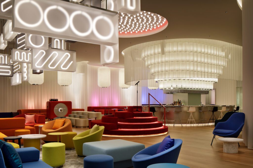
In a standard hotel, the first thing guests see is the check-in counter. Instead, when exiting the lift, W Osaka guests immediate see the bar – the social heart of the hotel. Above the bar glows row upon row of blown-up yet simplified versions of chochin, typical Japanese lanterns. Increasingly larger versions of these lamps hang in rows above the VIP booths, behind the bar. Acrylic was used to recreate the warmth of the traditional rice paper while adding durability. Carrying on the theme of reflecting and mirroring, the final row under the lamps is a pill-shaped shelf styled with chrome sake bottles by Kenya Hara.
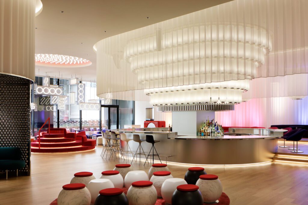
The pill-shaped bar – clad in satin stainless steel – wraps around a mirrored column featuring illuminated bottle steps. The white marble countertop offers 2 forms of seating – with black, white and grey bar stools on one side, and on the other side, a raised platform with table-height seating in chairs upholstered in neon-bright pink, orange, purple and magenta. These colours correspond with the VIP booth seating, behind the bar.
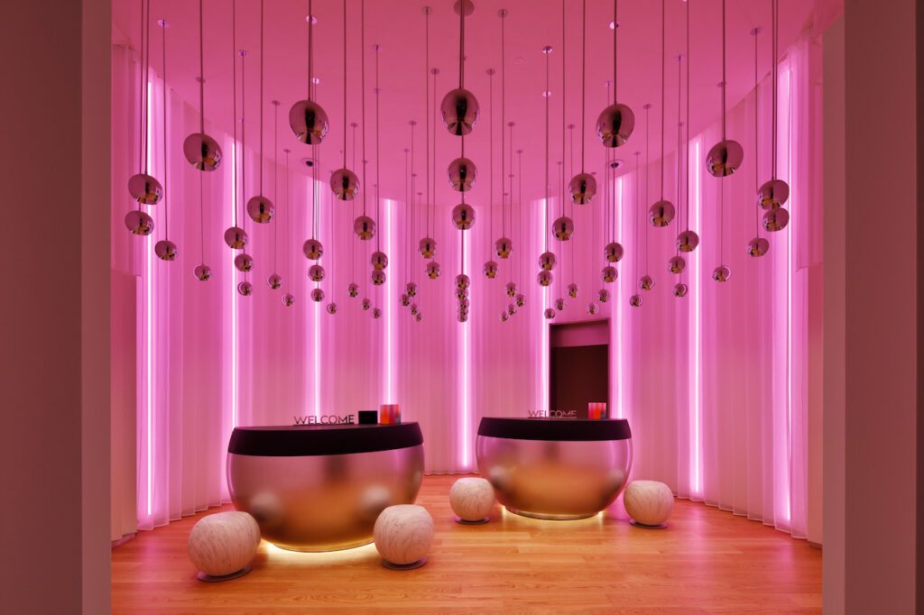
To welcome guests arriving for check-in, a comfortable welcome area was created with pachinko-inspired pod seating on a round, red rug. Tucked away, off to the side, the intimate hotel reception is wrapped in a circle of zigzag curtains against white wallpapered walls. Thin vertical lines of RGB LED lights shimmer through the zigzag curtains, in colours that coordinate with the season. The receptionists’ stations are also pachinko inspired – this time blown up to countertop height. Above hangs a cloud of chrome balls, shining warm downlighting.
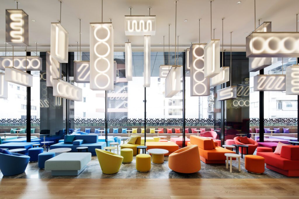
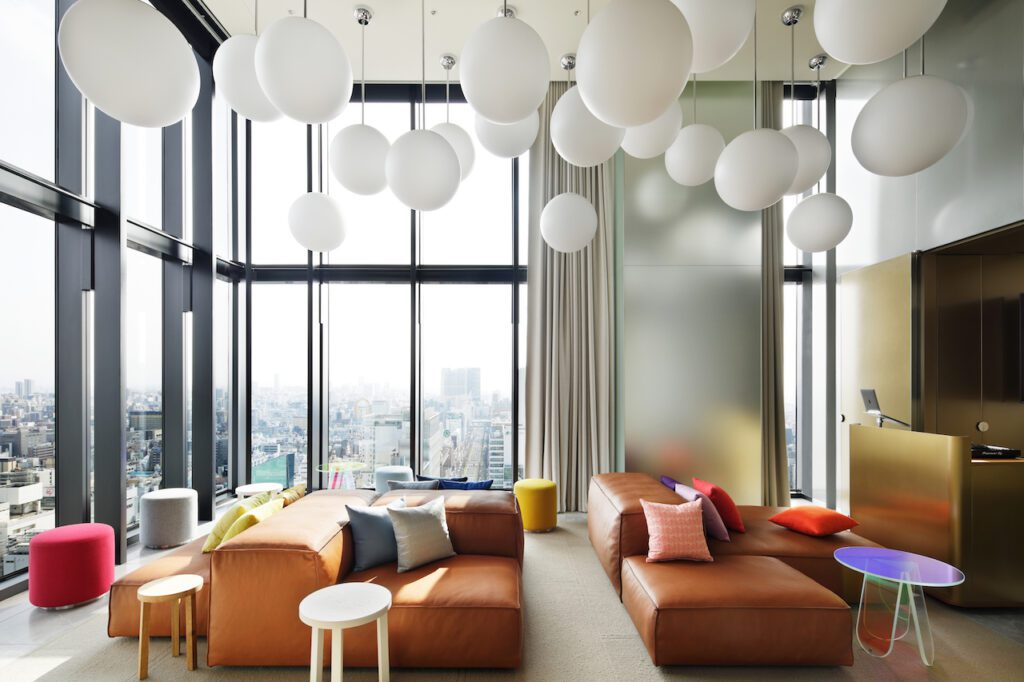
Guests are welcome to relax (and people-watch) in the hotel’s Living Room – half indoors, and half outdoors in a covered patio, divided by a glass façade. The marble floor layout is based on tatami mats and defines the space both inside and out.
Sofas, pouffes, lounge chairs and tables are positioned to group social life. Curated furniture includes playful lounge chairs by Tacchini as well as Lensvelt AVL Glyder sofas, designed by Atelier van Lieshout. These were customized with powder-coated stainless steel plinths, and upholstered in a wonderfully textured material in bright colours. Everything is arranged from purple to pink to orange to yellow to blue to green – forming an abstraction of Osaka neon.
Above the indoors lounge floats a wild cloud of rectangular lamps, hanging vertically and horizontally, at various heights. White zigzag LED “neon” lights shine through the translucent acrylic forms, in a desaturated homage to Osaka neon.
Along the edge of the outdoor terrace, a long bench faces inwards. Bamboo planting separates the patio from the city, for a sense of seclusion with glimpses of city life between the green leaves.
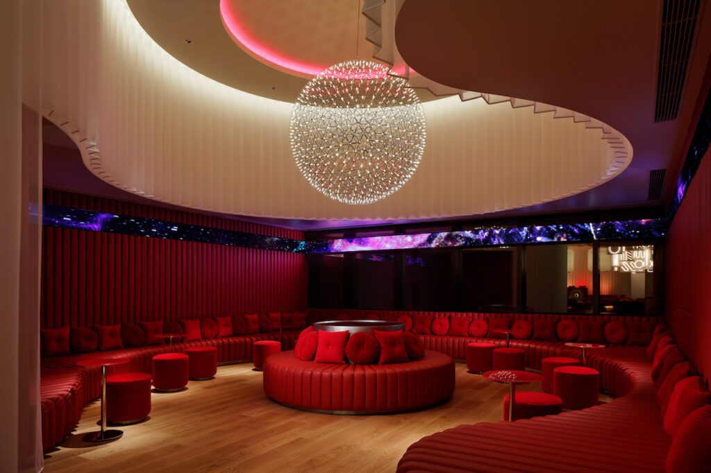
Just beyond the living room, the VIP room features a circular bench in the centre – and a large sofa built along the walls – creating a circle within this intimate square room. The bench, sofa and walls are upholstered in tuck-and-roll pleated crimson leather – with the deep corners of the sofa forming lounge-worthy daybeds.
The sofa is dotted with round and square crimson accent pillows. And running around the room is a dynamic news ticker tape, as used at the Japanese stock exchange, for graphics or personal messages.
The circular bench in the middle has a stainless steel back holding a crimson mirror inlay on top. By removing the seating elements and replacing the crimson mirror with a faux white marble top, it transforms into a buffet table.
Above the circle bench hangs an XL version of Moooi’s Raimond lamp, a double-shelled sphere made of stainless steel strips with star-like LED lights. For private parties, the sheer zigzag curtains can be drawn. Then it’s time to reveal the secret VIP bar, hidden behind a section of the leather sofa and wall.
French food and wine is a favourite in Japan, so all-day French and international dining are available in the hotel’s 160-seat Restaurant Oh.lala… – a collaboration with the chef of Michelin-star restaurant, La Cime.
With its floor-to-ceiling windows, the restaurant offers amazing views of Midōsuji Boulevard and the custom artwork encasing the hotel’s main entrance. The interior design draws its inspiration from traditional French cuisine’s copper pots and pans, as well as the typical Breton shirt. Its blue and white stripes have been changed shape into the hotel’s characteristic circles and zigzags.
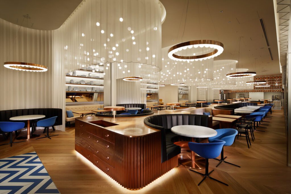
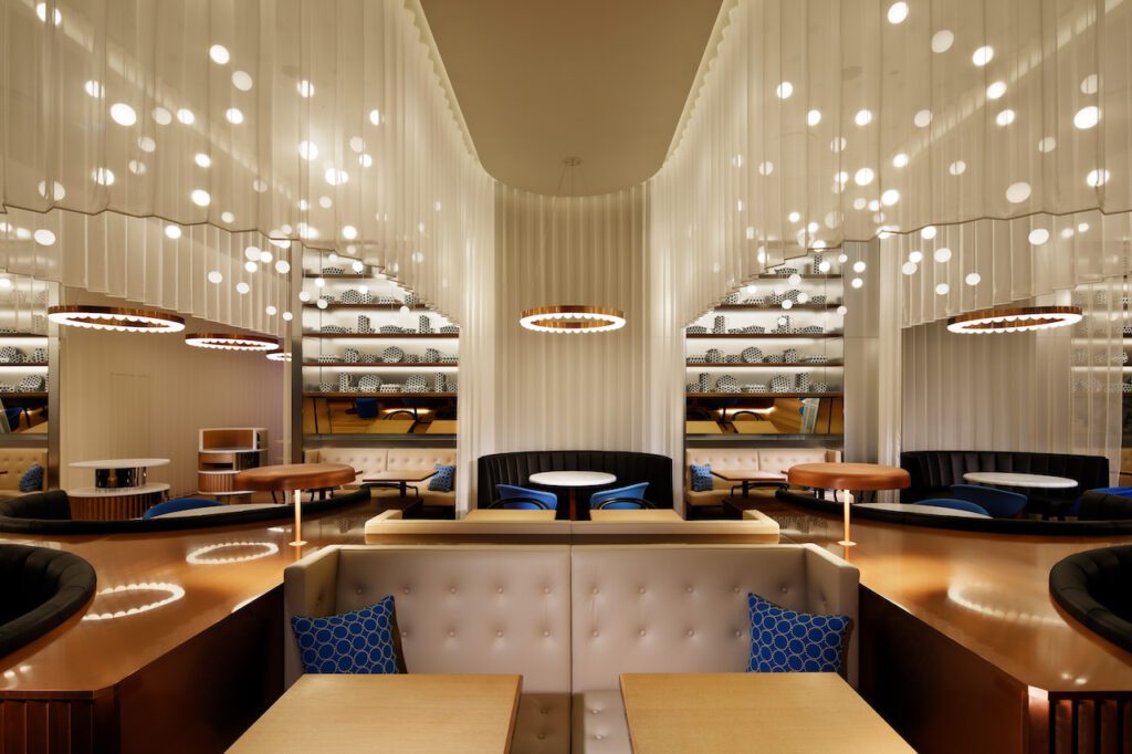
Guests enter from a hallway lined with zigzag-curtains, as the oak plank flooring shifts into a chevron pattern. The sheer curtain rises and falls, curving intimately around booths and tables, which merge together into a modern take on the traditional, shared brasserie dinner table – here clad entirely in copper-toned metal. Seating is also found along the windows and in niches along the back wall.
In the booths and along the wall, rounded and squared sofas alternate in black and white leather. Round and square tabletops also alternate in white marble and oak – all on copper stands. The types of chairs used vary between the classic Thonet and Arper Duna 02 swivel chairs in 2 tones of blue.
Along the wall, behind the white sofas, are tilted mirrors, for an extra opportunity to people watch. And above all that, stainless steel shelves are styled with unique porcelain objects decorated in blue dots – combining traditional French shapes and colours with the boldness of Osaka.
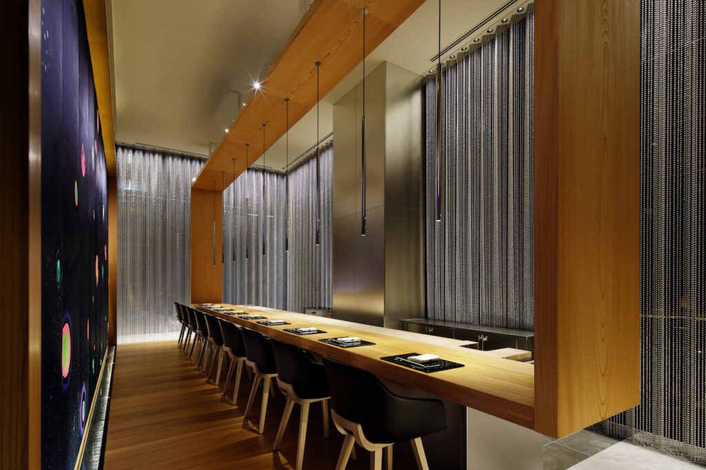
Down a long zigzag-curtain lined corridor hides a secret world accessible only to those in the know (and with a coveted reservation). An unassuming stainless steel portal frames a stainless door with a small fish emblem.
Just wave your hand to activate the sensor, as the door opens into a narrow hallway clad in stainless steel and frosted mirror – leading you to W Osaka’s secret sushi restaurant, Ukiyo.
On a raised platform of Japanese zelkova hardwood – framed within a matching, crafted wooden rectangle suspended from the ceiling – are just 10 seats. The bottom of the frame forms a dining table – as guests enjoy a framed view of the city of Osaka and Ukiyo’s sushi chef creating culinary masterpieces at a stainless steel counter, elevating this dining experience into a work of art.
The wooden frame contrasts beautifully with the grey marble floors, and the chrome ball-chain curtains – an abstraction of water drops. Expanding on the theme of Osaka’s (and sushi’s) relationship with water is the bespoke textile art by Lok Jansen, a Dutch artist living in Japan. Jansen’s waterscape represents the flowing waters and shimmering creatures of a secret, underwater world – with abstract bubbles in the colours of Risography, a technique invented in Japan.
Health and wellness are found on the 4th floor, with its smooth walls and rounded corners. Each area has its own character – colour-coded in shades of green, grey, blue or pink tiling to define the space’s function.
Inspiration was also drawn from onsen, Japanese hot spring spas looking out over nature. Indoor bathhouses, sento, bring nature indoors by using wall paintings. The endless line of the horizon is the simplest abstraction of nature. This line becomes a playful element connecting all the spaces on this floor, as an illuminated chrome horizon flows along the walls, between stone and tiling.
Guests are welcomed at the beauty bar – the heart of this floor, offering non-alcoholic refreshments. The bar is made of half-round oak slats that accentuate its natural curves. The acrylic countertop – at the height of the horizon line – glows warm white from within, while the recessed, illuminated plinth makes it seem as though the bar is floating above the grey marble flooring.
Live plants bring nature indoors. Seasonal arrangements in a variety of vases stand on the circular, stainless centrepiece with illuminated steps – softly lit from underneath. Above hangs a custom light fixture made of acrylic tubes attached to brass rings, gracefully suspended in graduated sizes.
Behind the bar, sheer wavy curtains create a beauty pod – ideal for a quick massage. On the one side, sliding glass doors open onto the courtyard – while on the other side, walls of grey granite stone are topped with the chrome horizon line and colour-coded tiling. Shades of green for the spa, and grey for the gym.
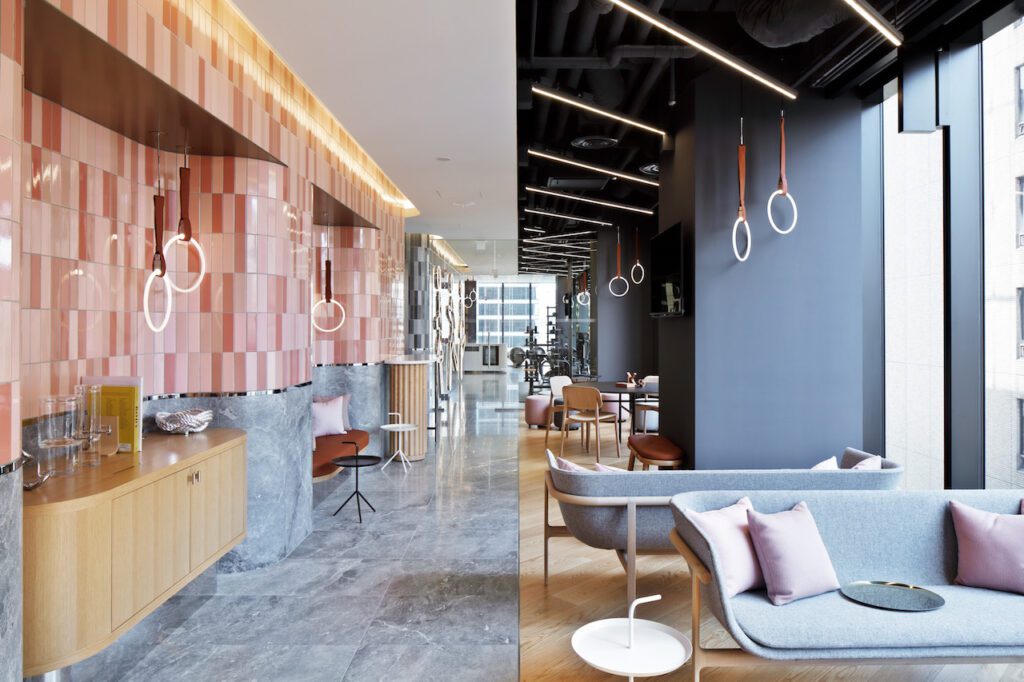
The corridor tiled in shades of grey leads guests to the gym, with great views of the city. The chrome horizon line continues inside, between the grey tiling and grey marble wall cladding. Running along the tiling is an LED artwork inspired by the famous Osaka landmark, the neon Glico Running Man.
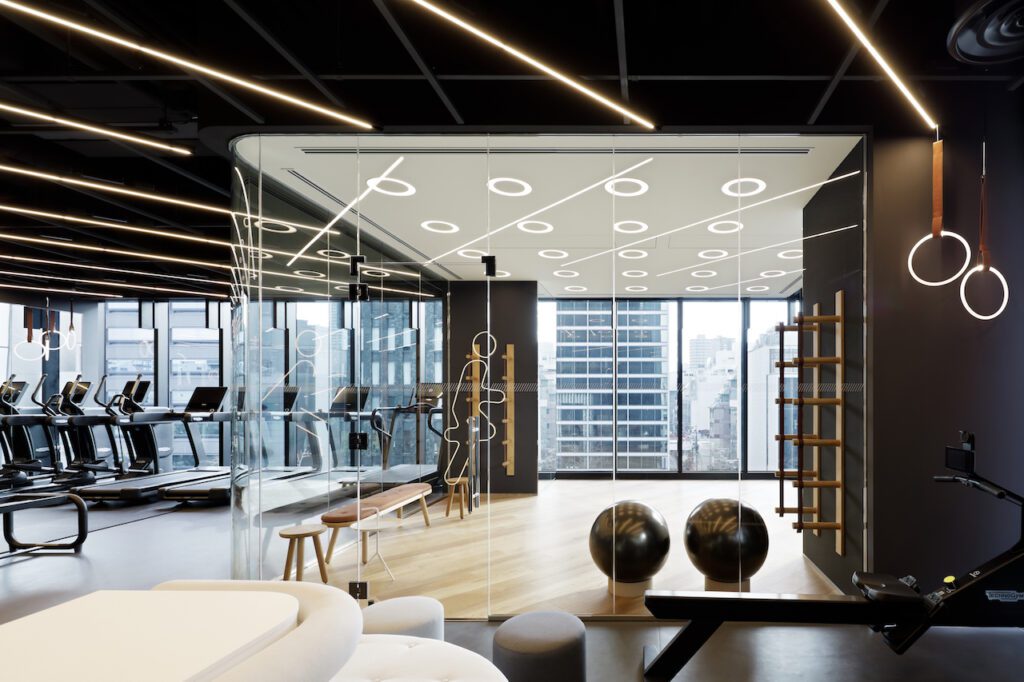
A path of grey marble leads the way to the equipment – on anthracite sports flooring – and the member’s lounge, with oak flooring. The ceiling above the pathway is lowered in white – contrasting with an exposed ceiling that reveals the inner workings of the building, with the industrial pipes painted dark grey. To add a dynamic touch to the exposed ceiling, radiating across the space are acrylic tube LED lights mounted on chrome. Beyond the equipment is a glass-enclosed yoga room with oak flooring.
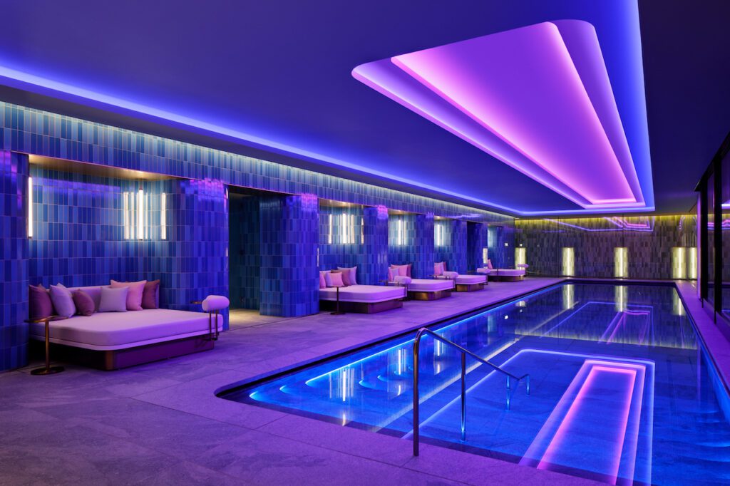
Tiling in shades of cobalt blue and grey granite flooring distinguishes the pool area, which runs alongside the courtyard. Tucked in niches with brass ceilings are comfortable day beds with brass side tables – perfect for lounging with a mocktail.
For visibility, the steps that lead down into the pool feature a light line. Above, a stepped cove ceiling mirrors the shape of the pool, with recessed RGB LED lighting that reflects the seasons in vibrant, cool colours.
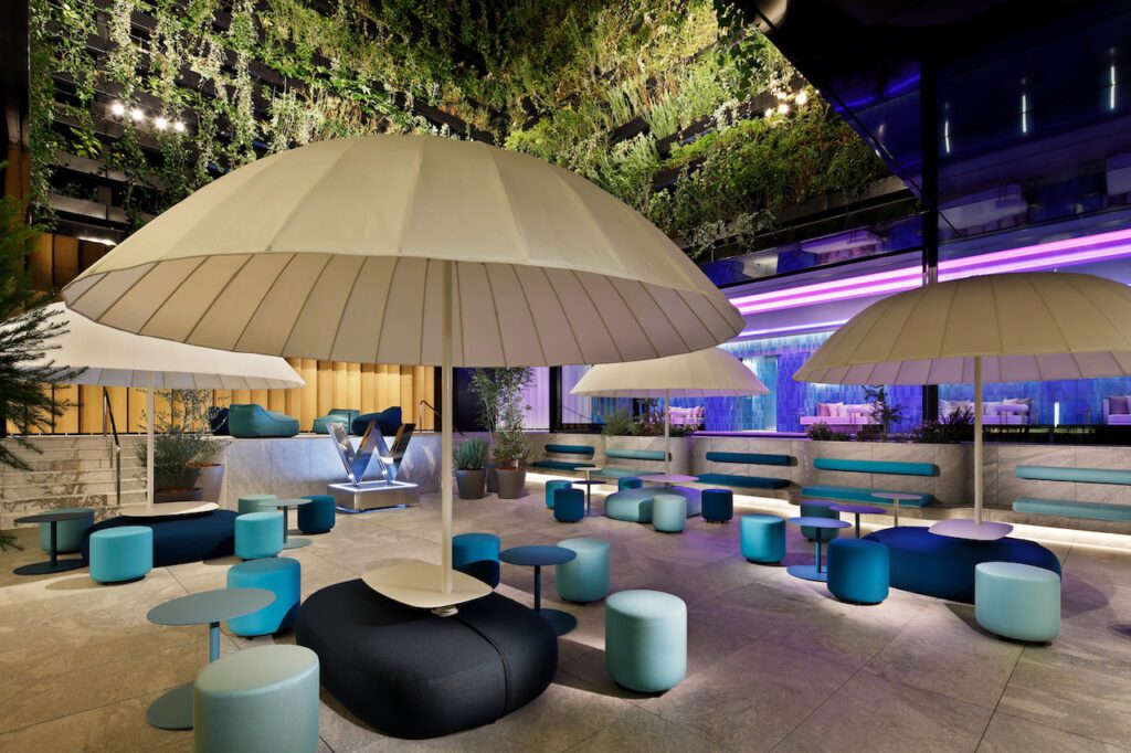
Open to the elements, with views of the sky – W Osaka’s courtyard is an oasis, with live planting trailing down the walls of the atrium. Sliding glass doors offer the flexibility to open up the surrounding indoor spaces. Along the back wall, pivoting panels of wood backed by shiny metal can be flipped to change the character of the space.
From it’s elevated position on the horizon line, the pool forms a blue backdrop to this area. Along the horizon is also a row of lounge chairs, between natural grey granite steps leading down into the courtyard.
Landscaped into terraced layers, the granite expands and wraps around the courtyard – flowing in waves from functional steps to lush planters to comfortable benches in niches, furnished with soft cushions. Turquoise and aquamarine backrests are mounted into the wall. Freestanding planters enhance the sense of nature.
Large turquoise and aquamarine islands – Paolo Lenti seating elements with white tables and parasols – as well as pouffes and lounge chairs in related colours dot the landscape and create a sensation of garden luxury. A stage for DJs transforms this oasis into a lively events space.
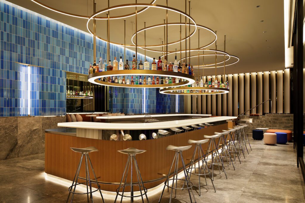
Directly adjacent to the courtyard, guests can grab a cocktail at the WET bar. The curved, floating design corresponds with the beauty bar – seen through the sliding glass doors across the courtyard. The walls behind the bar are tiled in the same shades of blue as the pool, with grey marble cladding the wall below the horizon. Suspended above are 2 brass rings with uplighting, illuminating the colourful bottles of the many drinks available. Above that is LED lighting made from 5 interlinking brass rings.
From the arrival lobby, guests heading to functions, meetings – or stylish weddings – walk up the iconic oak hexagonal asanoha staircase, with its crafted oak steps and sakura pink metal tubing, to enter the pre-function area.
In keeping with the asanoha and origami inspired ceiling in the arrival lobby, the ceiling in the main pre-function area is an extravagant 3D interpretation of this iconic Japanese pattern. Mirrors mounted above satin stainless steel walls appear to take these shapes onwards, into infinity. Running along the top of the wall is a pink neon-inspired installation – representing the heartbeat of Osaka. Lighting from the wall onto the 3D ceiling creates playful shadowing.
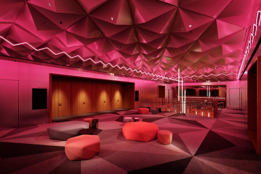
An oversized asanoha pattern was used to create the velvety carpet flooring, in 6 shades of grey. Behind the staircase is a freestanding bar – which also serves as a buffet – featuring a pink marble countertop and cabinets with pink-tinted metal doors. All this is backed by a bronze-pink mirror.
Guests are welcome to relax on oak stools at the bar. Dotted throughout the area and the stairwell are origami-inspired pouffes in shades of blossom and grey, designed by Tokujin Yoshioka for Moroso With the use of Hay side-tables, Japanese design sits comfortably alongside European design.
A tunnel clad in oak connects the main pre-function room to the second pre-function room. This space is designed for more intimate groups – or as a breakout area for meetings. With its striking, star-shaped vaulted ceiling, this room unites the oak framework structures of the function room and studios off to each side – a design inspired by contemporary Japanese architecture.
Here, the oversized asanoha-patterned carpet is in rich shades of gold – inspired by the autumn foliage of the ginkgo trees lining Midōsuji Boulevard, seen just outside the window. On either side of the oak tunnel is a service bar, with a grey countertop and cabinets with stainless steel doors. All backed by a grey-tinted mirror.
Forming the centrepiece of the room is a large oak buffet table and 2 smaller tables, forming a cross – and crafted using traditional Japanese wood joinery. This is surrounded by playfully positioned pouffes and side tables.

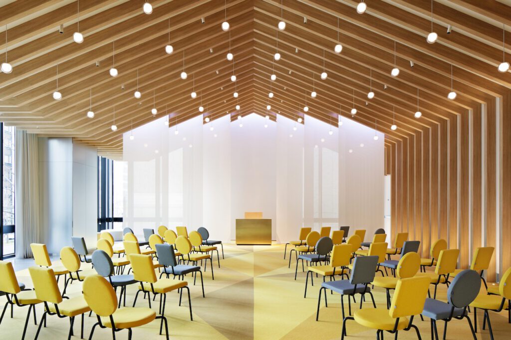
With its vaulted, oak framework ceiling and floor-to-ceiling windows, the grand meeting room has the airy feeling of an open structure. Sparkling like stars above are small globe lamps, suspended mid-air. The carpet – in golden asanoha patterns – extends from the pre-function room into this meeting room, unifying the spaces.
A total of 337 guest rooms are located on the 6th to 27th floors – and include standard king and double queen rooms, corner suites surrounded by floor-to-ceiling windows, and the 200m2 presidential “Extreme Wow” suite. The use of colour in public spaces and rooms differs per floor, with sakura pink alternating with blue.
From the 3rd floor arrival area, elevators take guests up to their rooms. Inside the lifts, a line of light frames all edges of the walls, ceiling and floor. This creates the sensation of standing within a cube of light. The dark-grey mirrored walls reflect the reflections of reflections on and on, into breathtaking infinity.
On each floor, the lifts open onto a lobby lined with dark grey mirrors. Reflections of the semi-circular pattern of the black-and-grey carpet create a complete circle in the mirrors – and where 2 circles meet, they point directly aimed at the lift doors.
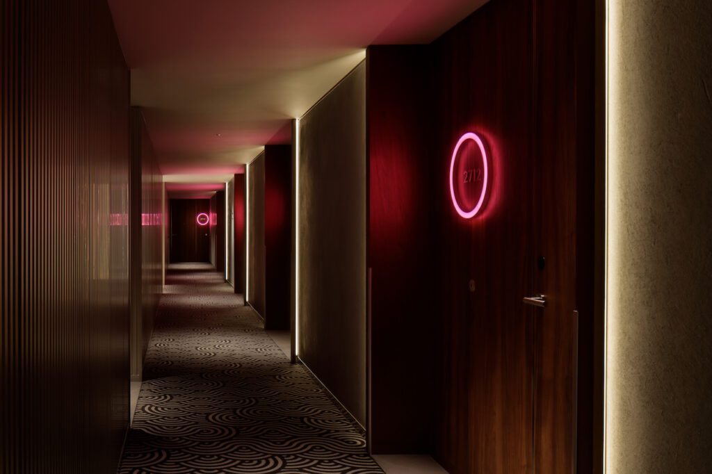
A portal clad in grey marble takes guests from the lift lobby to the corridor. Hotel corridors don’t have to be boring places! W Osaka’s hallways feature custom carpeting, with designs based on the overlapping concentric semi-circles of the ancestral 6th century Seigaiha “blue sea and wave” pattern. By merging the waves into complete circles, and layering them, this pattern swirls like an Escheresque ocean, roiling onwards in black and grey.
On one side of the corridor are walls in corrugated aluminum, a material often seen in Osaka architecture. Opposite this are polished, sparkly cement walls.
Grey marble flooring marks the entrance to each room – with a walnut doorway set into a walnut niche surrounded by recessed lighting. The room numbers are encircled with a neon-inspired halo of light – glowing in pink or blue. To reflect this light, room numbers are crafted from satin stainless steel.
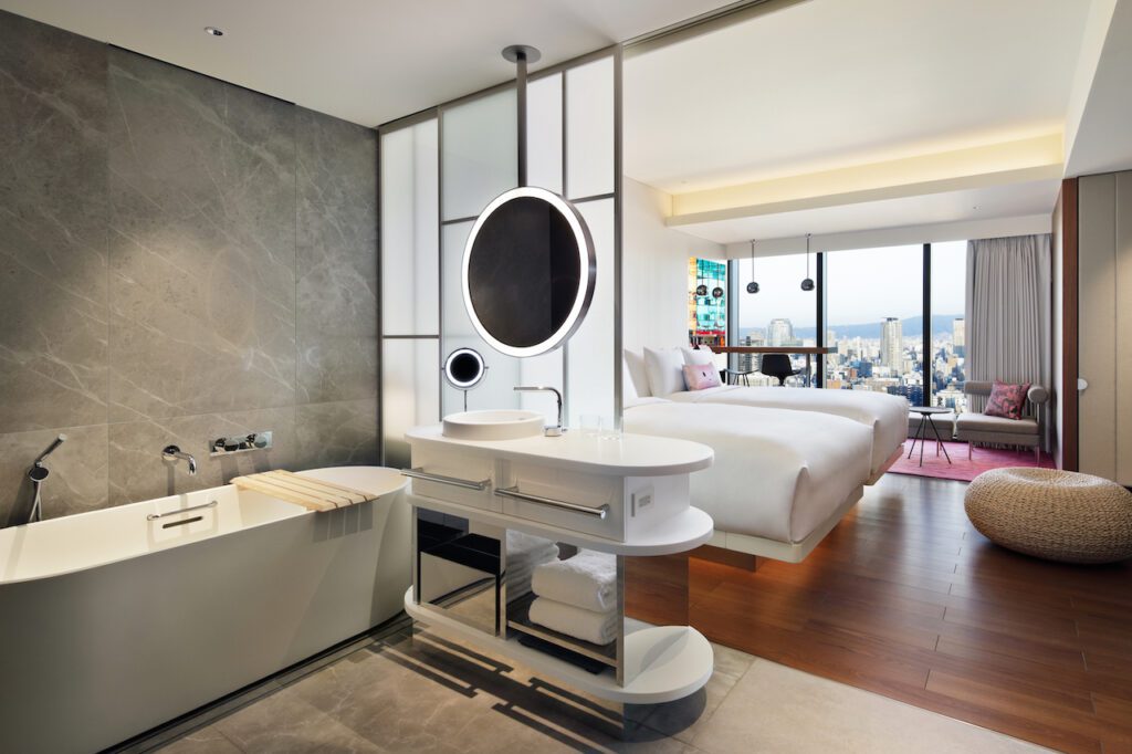
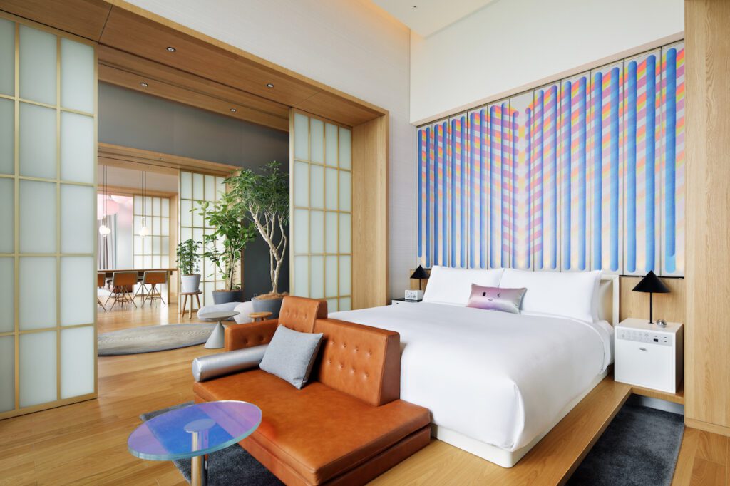
The colour theme of the guest rooms alternates per floor, between sakura pink and blue – allowing guests to choose the colour they prefer. Entering the standard room through the walnut-clad hallway, the semi-open bathroom is immediately visible – with the line of site passing through the sleeping zone to the living room area. Floor-to-ceiling windows bring in natural light and views of the city.
Having a semi-open bathroom offers guests the level of privacy they prefer – with the option of closing off the bathroom from the sleeping area using the translucent glass sliding screens – a deconstructed version of the traditional Japanese shoji screen. The entire bathroom is clad in grey marble. Guests can either enjoy a good hot soak in the white, freestanding tub – or use the separate shower, located behind grey tinted glass doors.
In the centre of the room, walnut flooring demarcates the sleeping zone. A walnut ledge runs across wall, extending into the living room. This holds the king bed, bedside tables and black cone lamps – as well as the living room sofa. Behind the ledge, soft uplighting illuminates a white plaster wall. A round, rice paper lamp, inspired by Japanese fans, softly glows on the wall. At the foot of the bed is a large pouffe, made of the same material as tatami mats. The room’s control panels are integrated into the side table, in a stainless steel panel.
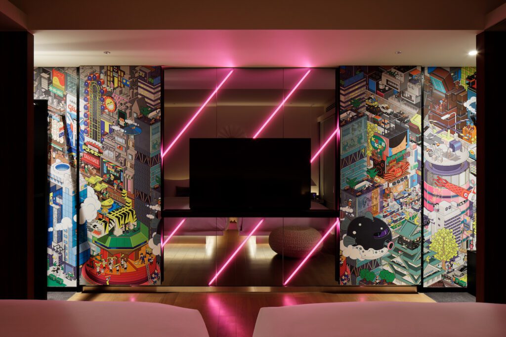
Housekeeping uses two special features to change the atmosphere of the room between day and night. The TV is mounted against wall made of grey-tinted 2-way mirrors – which conceals a lighting feature. When turned on, it transforms the room with dramatic in pink or blue diagonal stripes, inspired by Osaka’s neon. On the TV’s black oak shelf two custom W kokeshi dolls welcome the guests and keep them company during their stay.
By flipping the signature cushions on the bed, housekeeping changes between the day look – a cheerful kawaii smiley face winking on colourful shimmering silk – and the desaturated night version of the smiley face now asleep.
Another surprise is locked away behind the walnut doors of the closets. Famous for their gamer’s pixel art, eBoy graphic designers created a “pixorama” of Osaka, filled to the brim with the city’s famous landmarks in full pixilated colour. This design fully covers the interior of the closet – for a burst of playful fun. A desaturated version of this wallpaper is used in the standard and junior suites closets.
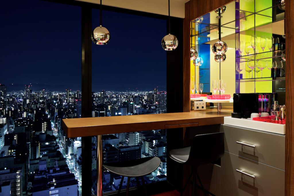
The 3rd area, the living room, is defined by soft carpet in a gradient pattern running from pink (or blue) to grey. Each room has a sofa and a walnut cocktail bar with 2 stools, which can also serve as a desk.
Of course, main purpose of the bar is enjoying cocktails. The bar extends into a niche lined with reflective, rainbowy dichroic film, with a mirror backsplash. The niche holds a minibar, the neon acrylic munchies drawer, a hot drinks station (with everything needed for a tea ceremony) – and a cocktail shaker with proper bar glassware.
More colour shines from the small table, topped with dichroic film – as the chrome pendant lights reflect onto the tabletop, which reflects on the floor and ceiling – and into the bar niche, for a taste of colourful Osaka.
Another eBoy touch has been added to the woolen sofa cushion – solid pink or blue on one side, and a scene from the eBoy pixorama on the other, in desaturated tones of pink or blue.
High above Osaka, on the 27th floor, the Extreme Wow suite looks out over – and beyond – the skyline of the city. Inspired by traditional Japanese homes, the suite was designed in a sequence of 5 rooms divided by deep, oak portals. Oak plank flooring connects the dining room, garden entrance area and bedroom, while grey marble is used along doors and windows, and in the bathroom. Rooms can be closed off for privacy using sliding shoji screens set in brass frames.
The overall design is based on the duality of simplicity and extravagance, allowing guests to change the atmosphere of the suite. Whether they desire an intimate and personal ambience, or want to create a more extroverted setting for entertaining.
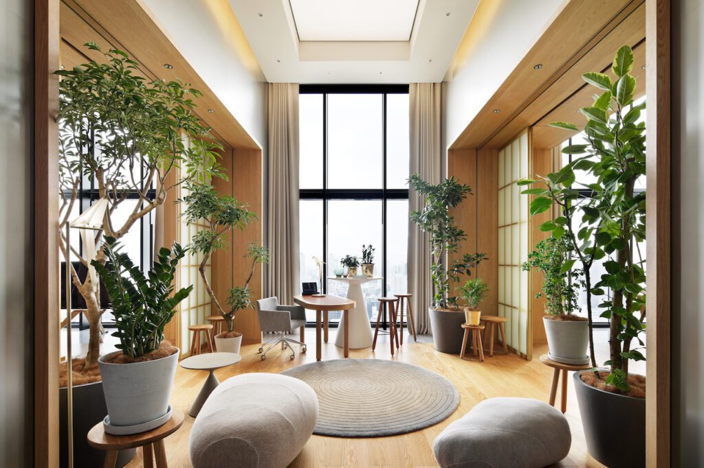
Guests arrive through double doors, entering the garden room at the heart of the suite. The feeling is reminiscent of a Zen garden – with delicate live trees, rugs with a concentric circular pattern, and stone-grey pouffes scattered in amongst the plants.
The double-height ceilings feature a textile membrane that acts as a skylight – and can change color for entertaining. At the back of the room, a high, cone-shaped table displays accessories and plants – and doubles as a DJ stand during parties. In case of work, there’s a desk area in front of floor-to-ceiling windows, for plenty of natural light.
Just beyond the garden arrival room is the suite’s bedroom – with a sitting area and a sleeping area. The king-sized bed is placed on a simple yet elegant oak platform. Opposite the bed, on either side of the room, floor-to-ceiling shelving displays curated accessories. A TV is mounted on an elegant oak tripod. Guests can sit on a sofa in front of the bed and enjoy the view – or watch a good movie.
Behind the bed is a wall made up of panels that pivot individually, separating the bedroom from the dressing room. Mirrors are mounted on one side of the panels. On the other side is a custom textile art by Sigrid Calon – a colourful abstraction of neon and pachinko in jacquard, woven by the craftsmen of EE Exclusives. Calon also created textile art for the hotel’s 2 Wow suites.
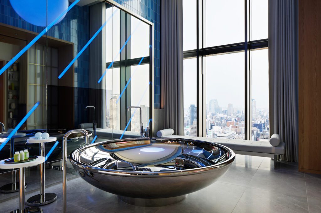
With blue-tiled walls and grey marble flooring, the bathroom features a raised grey marble platform floating on a ring of light. Here stands the bath – an inviting champagne coupe of stainless steel, big enough for a few good friends and ideal for filling with ice and bottles of bubbly during parties.
On the wall behind the bath, the portal sensation continues with 2-way mirrors framed in oak. This camouflages a mirror TV – as well diagonal stripes of light that can be turned on for a taste of Osaka neon. Above the bath hangs a giant globe glowing in warm white – with RGB LED that can change colour to suit the mood.
Alongside the floor-to-ceiling windows is a relaxing day bed, and a niche with oak cabinetry, for bespoke styling accessories. Opposite is a freestanding vanity in white Corian with pill-shaped standing mirrors. Behind the vanity, facilities include a spacious double shower in grey marble, and a separate toilet.
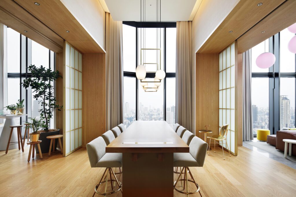
Standing tall in the centre of the dining room is a simple but oak table, finely crafted using Japanese woodworking techniques. Round glass pendant lamps hang at different heights above the table. The Golden Chair by Moooi adds an extra touch of opulence.
Guests – or their chef – can prepare meals in the dining room’s open kitchen – which features a gold-clad cooking island. Cabinetry is in golden metal, with a stainless steel backsplash. Above the kitchen island, 2 levels of racks contain a curated selection of green bottles, blown into sensuous shapes by Klaas Kuiken. These bottles can also be found in the hotel’s Wow suites.
Passing through the oak portal, guests enter their private living room, surrounded on 2 sides by glass. An island is formed by a cognac leather sofa, with an array of neon-colored cushions. Dichroic tables by Glas Italia shimmer a rainbow of colours. Custom pouffes offer additional seating. Niches on either side of the oak portal are styled with curated accessories.
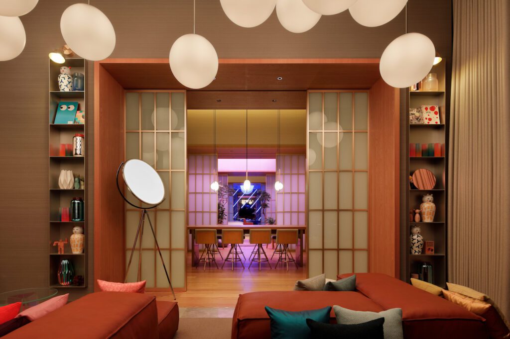
Above all this hangs white acrylic LED RGB lighting – globes of various sizes that can go from warm white to any colour, to create the right atmosphere.
And what’s behind those double satin stainless steel doors? A secret karaoke booth – clad entirely in brass – with a giant TV screen on the wall. Off to the side, from a hidden room, a brass DJ booth can be rolled out when it’s time to party.

Publisher of Hospitality and Leisure News, 365 Retail, Retail Source and organiser of the Creative Retail Awards.


