Bristol-based hospitality and retail designers Phoenix Wharf have just completed a new store and café-deli for local ethical foodie heroes ‘Better Food’, who first set up their independent organic, local and ethical food business 30 years ago, starting out supplying veg boxes in the city. The business, which employs over 100 people passionate about food, health, the planet and its customers, has now opened its fourth store – a new 3,000 sq ft combined retail outlet and café-deli on Bristol’s lively Gloucester Road – the UK’s longest road of independent stores.
Phoenix Wharf, a locally-based design agency passionate both about sustainability and helping local businesses to flourish, was the perfect design partner for the project, which followed on from its Gold-award-winning schemes for The Bristol Loaf in Bedminster and at the Bristol Beacon and The Yeo Valley Café, where the agency helped take the leading Somerset dairy brand to London to open its first hospitality outlet in the capital.
‘We’re delighted to be working with such a great local food pioneer’, Emma Carter, Associate Creative Director and the project leader at Phoenix Wharf, commented, ‘with many of our team already shopping regularly at other Better Food stores around the city. We’ve gone out of our way to research and find the most interesting sustainable products to use for this project – including one in commercial use here for the very first time!’
Stand-out materials used on the project include Marmoleum Marbled flooring from Forbo – which is free from synthetic additives, is carbon neutral and is made of 97% natural, raw materials, including 62% from renewable sources and 43% from re-used or recycled materials. The project’s table and counter tops meanwhile feature the first ever commercial interior use of a brand new surface from Nurdle – a hard-wearing material made from washed-up ocean plastic. The Phoenix Wharf design team approached the not-for-profit business’s owner – also local to the South West – and asked if their material, previously used for mobile phone covers, could be adapted for commercial use. As the company had already been thinking along those lines, it was a happy coincidence in terms of timing and Nurdle is delighted for the scheme to be the first to feature this material.
In its brief, Better Food asked the Phoenix Wharf team to create a contemporary, cost-effective scheme that made use of the brand’s daffodil yellow and green identity in its colourway, including its ‘bee’ icon, referring to the vital pollinating role played by bees in our food eco-system. Part of the brief was not to make the new design too upmarket or to risk alienating the business’s long-established core clientele – the business has a very strong community element and many local people in Bristol are proud to associate themselves with it, with a pronounced sense of ownership. Phoenix Wharf carried out an analysis of the retailer’s three existing stores in the early stages, speaking at length to the shopfloor teams in order to find out what did and didn’t work in earlier formats.
The new outlet needed to incorporate three main areas – a deli, refill area (where shoppers bring their own containers to access a whole range of ingredients) and a retail warehouse area, as well as back-of-house space, a staff room and washrooms. The long storefront at the new location permitted two entrances, so that customers can enter the deli area, where takeaway food and a small 14-cover café area is located, or go directly to the retail warehouse area to shop.
A design workshop with the client made sure to centre on the business’s mission: ‘Our values are at the core of everything we do and go beyond just the food on our shelves. We aim to be a positive force in our community – supporting local causes, campaigning about the things we believe in and making each of our stores a thriving hub of activity and events. We stock some of the best organic, local and ethical brands available, as well as organic fruit and vegetables, a huge range of organic food refills, chilled foods, locally sourced meat, fresh bread, bodycare and household refills, gifts and more.’
Emma Carter of Phoenix Wharf added that ‘the initial design workshop concluded that the materials used for the scheme should be simple, earthy and basic but also cost-effective and as sustainable as possible. We specified corrugated metal for example, which is very competitively-priced, whilst all the timber used on the scheme is in ply, bar some oak veneer. The project involved really in-depth materials research for our team, looking both at cost and sustainable profiles at every stage.’

The new store is made up of a traditional store space, a connecting corridor and a second, deeper building to the left-hand side, formerly a carpet warehouse. The two main sections were previously divided by a wall, now taken out to create a new, single and continuous interior, with the Better Food deli area to the far right, the refills section in the central, linking area and the retail warehouse in the deeper, left-side building section.
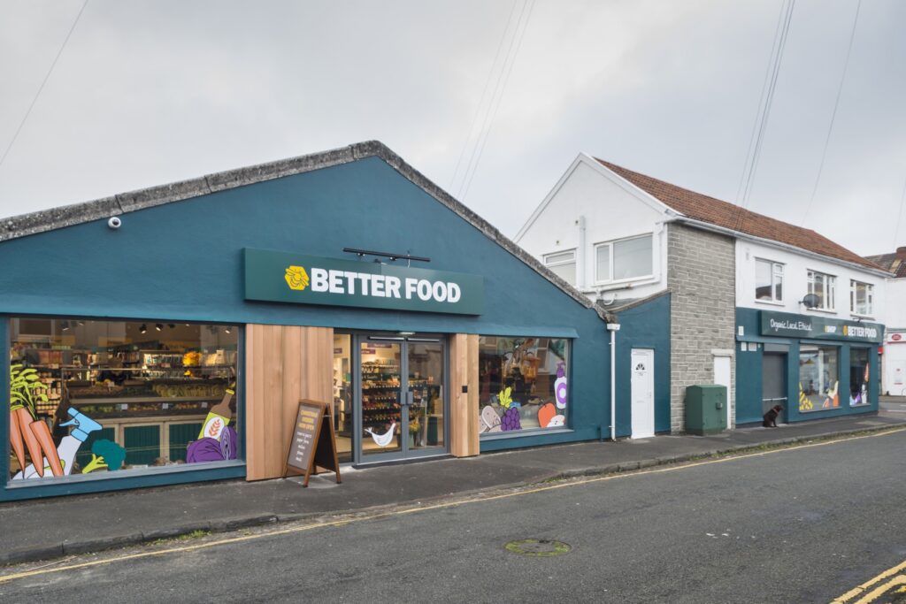
The new storefront was painted in the existing brand green with cedar, vertical, slatted cladding to either side of the retail warehouse entrance. Large storefront windows remain unaltered as relatively recently-installed and in a plain, simple and elegant dark grey aluminium, which worked well with the design concept for the space. The Better Food logo, along with the bee icon and ‘Organic. Local. Ethical’ strapline features on the storefront three times: first, on the retail warehouse section and then twice on the deli area, including on the wraparound side window. A number of graphic food icons, already belonging to the brand, communicate something of the range of food it sells, have been applied to the storefront glazing.

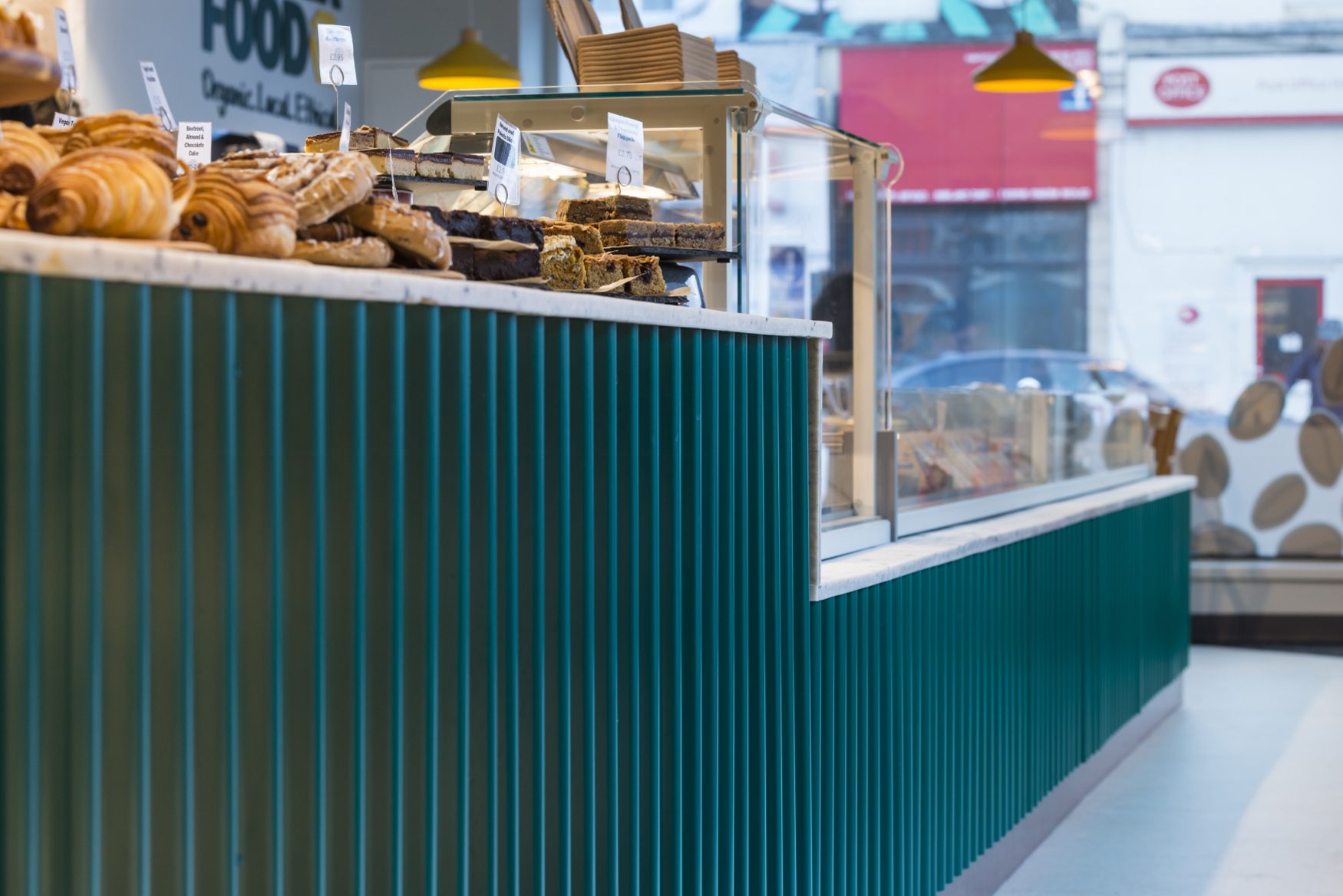
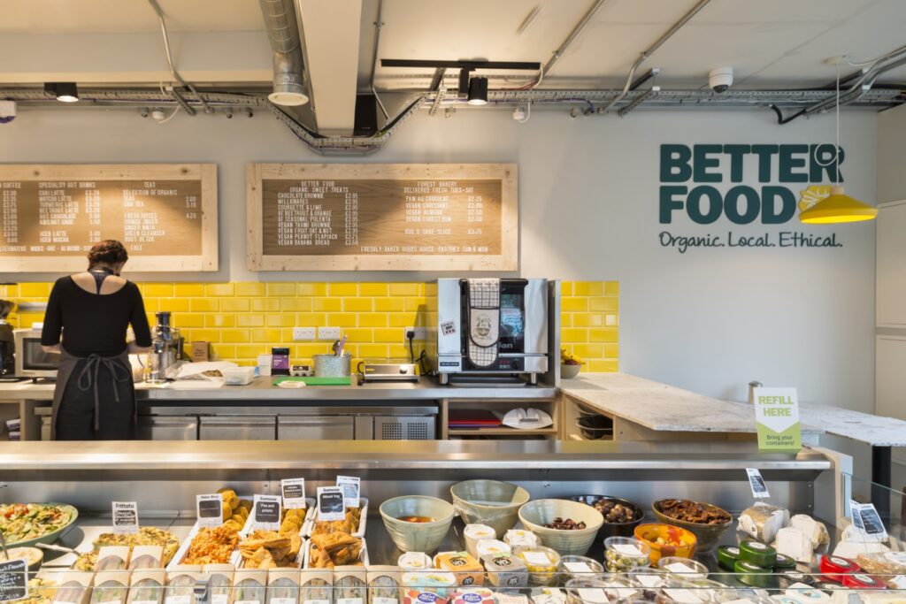
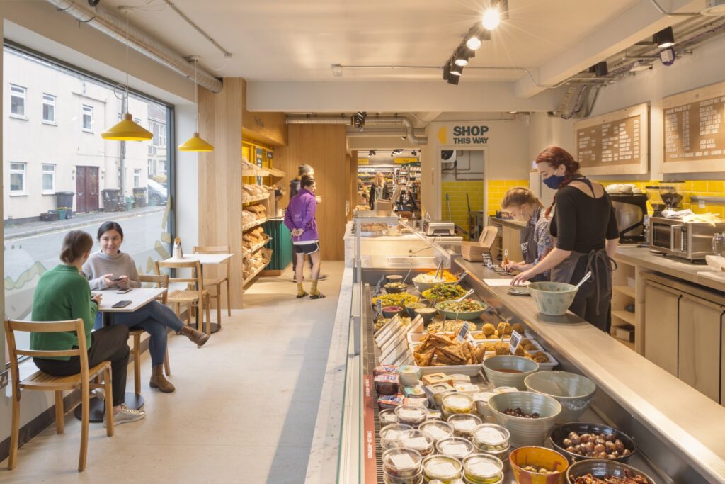
Inside, the deli area features a large servery against the back wall for takeaway food and to serve the 14-cover café, made up of two four-person tables and a series of two-person tables along the front window. The servery features a vertical corrugated metal front, powder-coated and painted in brand green with a mixed copper laminate and marble pattern mix at the base, in order to break up the linearity of the corrugate. The rear deli wall features an initial band of stacked yellow tiling – colour-matched with the bee icon within the logo – with peg boards above to post the day’s food menu.
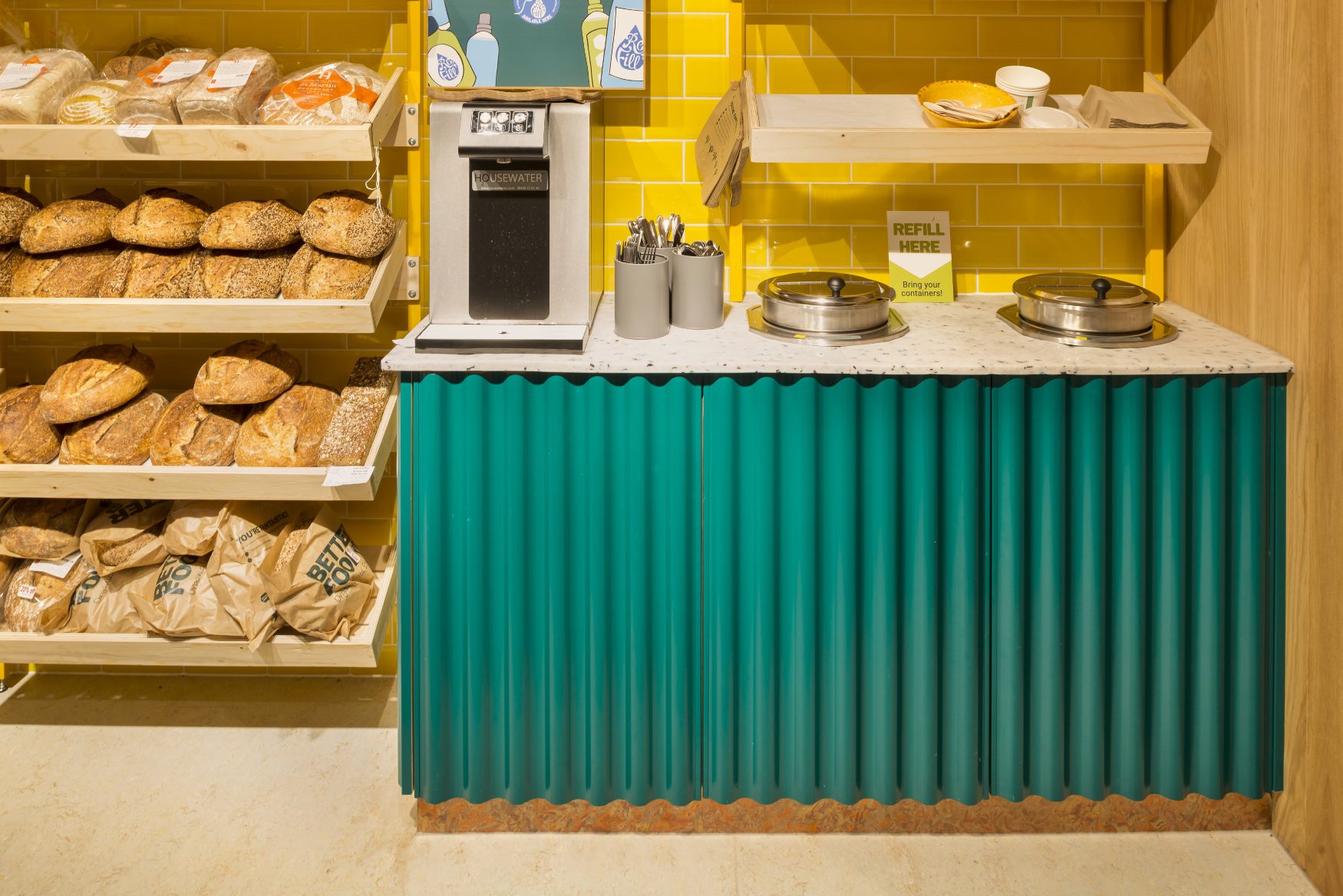
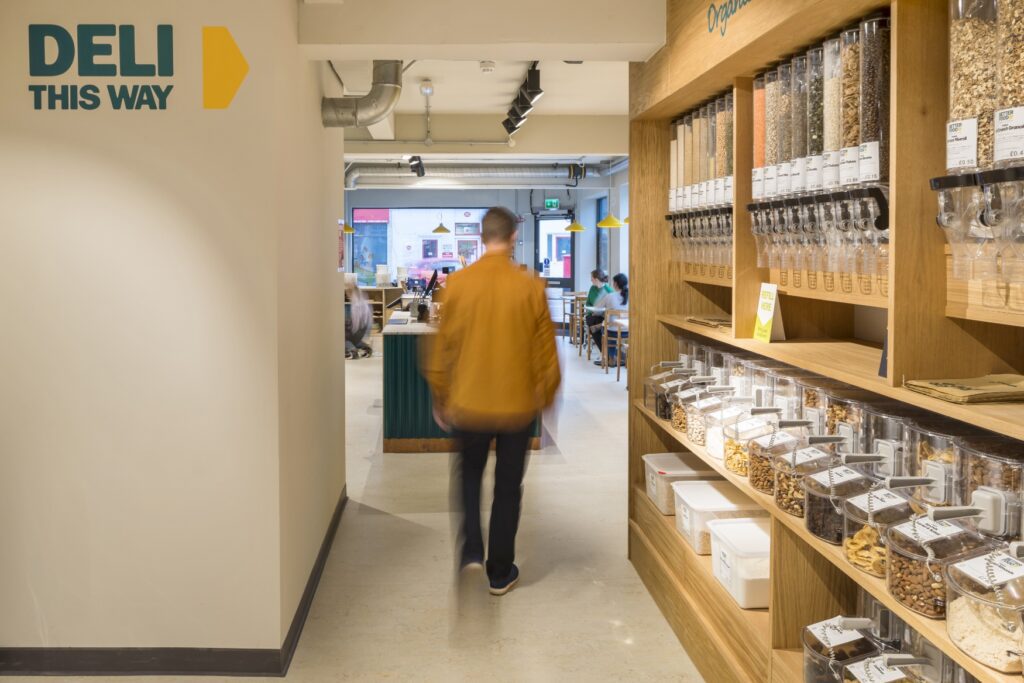
The deli’s 4m-long counter top and all table tops are made of the upcycled ocean plastic material from Nurdle (as mentioned earlier), with pendant lighting over the seating the Albert lights from Made in mustard yellow with additional directional spots on black tracks over the deli counter. Flooring throughout is from the Forbo Marmoleum Marbled range, whilst all walls are painted a warm grey. Existing ceiling beams in this section were uneven, so the design team decided to make them blend with the same grey rather than stand out with a different treatment. At the end of the deli area, a Fresh Bread area features the same yellow tiling as behind the deli counter, with oak veneer surround cladding. Internal signage is used in this store for the first time to help guide customers, using the existing fonts and style associated with the main branding, to delineate separate aspects of the offer. Just beyond the bread area is a soup servery area, where the frontage is once more in the same green, powder-coated corrugated metal, with a counter top using the upcycled ocean plastic material by Nurdle once more.
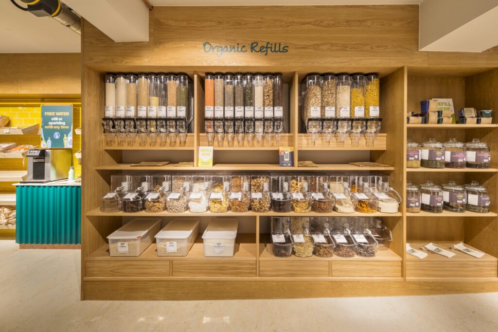
The refill linking area also features this material for its till counter, as well as a green corrugated metal front, with the copper and marble-effect laminate used once again at its base. Each individual food container here is labelled with the product it contains. Customers bring their own containers to pre-weigh and then deduct the amount from the product weight they’re purchasing, with all refill containers set within the section’s bespoke cabinetry with oak veneer.
In the final space, the retail warehouse area is a stripped-back, 1291 sq ft area, with a plain and straightforward design treatment, including the same black track lighting, grey flooring and paintwork as elsewhere and with additional high-level signage in green.
‘Our purpose at Better Food has always been to provide organic, local and ethical food and groceries for the local community and to help to drive and instigate change to build a better and fairer food system for all’ Phil Haughton, Better Food’s Founder commented. ‘Opening our 4th store in Bristol is an important step in this journey. We have enjoyed working closely with Phoenix Wharf and now have a fantastic looking new store. We were impressed by the time they spent understanding our needs and offering some innovative, original and unusual design solutions.’

Publisher of Hospitality and Leisure News, 365 Retail, Retail Source and organiser of the Creative Retail Awards.


