Pret A Manger’s has launched a new flagship store in Heathrow Airport Terminal 2. This premium retail space sought for a unique identity whilst maintaining the Pret A Manger brand. A revived secondary colour palette brings refreshing tones to a contemporary industrial aesthetic, with bespoke joinery features welcoming guests in at one of the world’s busiest airports.
As InsideOut’s first project for Pret A Manger, they were appointed to design and deliver this 4400ft2 unit, setting a benchmark for Pret’s operations and retail within Heathrow Terminal 2. InsideOut worked closely with Pret’s project and design team to streamline customer flow and service in a typically swift-paced airport environment.
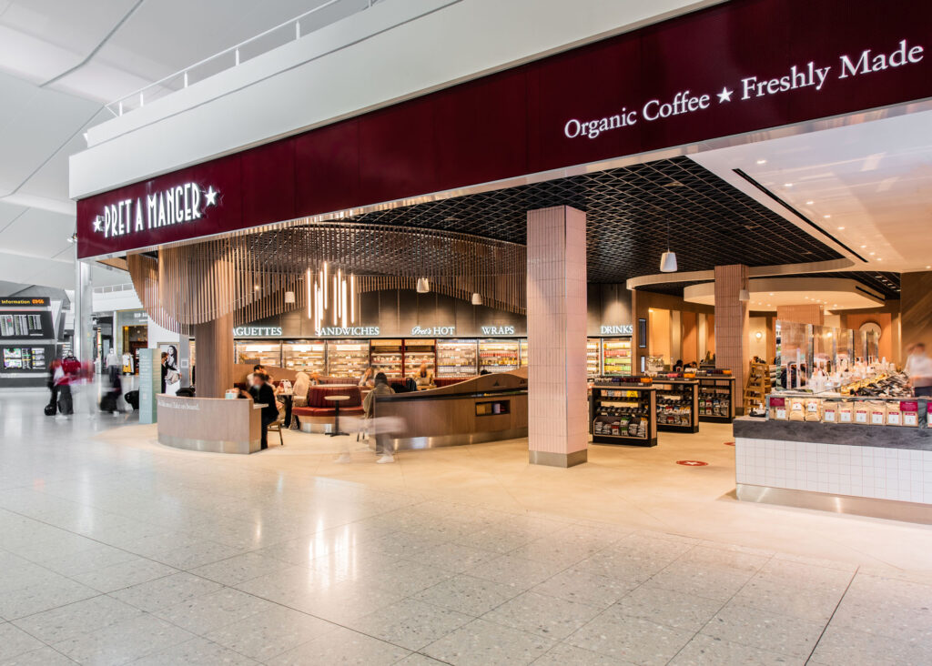
With a shop front that spans 24 metres, InsideOut knew this was a perfect opportunity to amplify this well-known brand in a densely populated retail space. They opened up the previously obstructive facade, not only to accommodate peak footfall, but to provide full transparency through the store and allow the design to be read holistically. Pret’s brand name and colour form a strong entrance portal, bookended with digital displays to showcase their offering. Eye catching joinery is centred along the shopfront to guide customer flow, display merchandise and provide seating that looks back into the terminal.
Chris Parker, InsideOut, Founding Director said “InsideOut are no strangers to the often-challenging world of airport interiors, having completed over 20 airside projects over the last 10 years. Our design for this project combines the classic Pret A Manger look with their revived secondary colour palette to bring consistency to their brand recognition and a uniqueness to this Terminal 2 store. Reviewing passenger and operational flow in depth lead to this simple, open and natural floor arrangement. Warm joinery ties the whole shop together in this modern industrial aesthetic, with playful tones in the linings and upholstery offering guests a spacious and refreshing environment prior to their onward travel.”
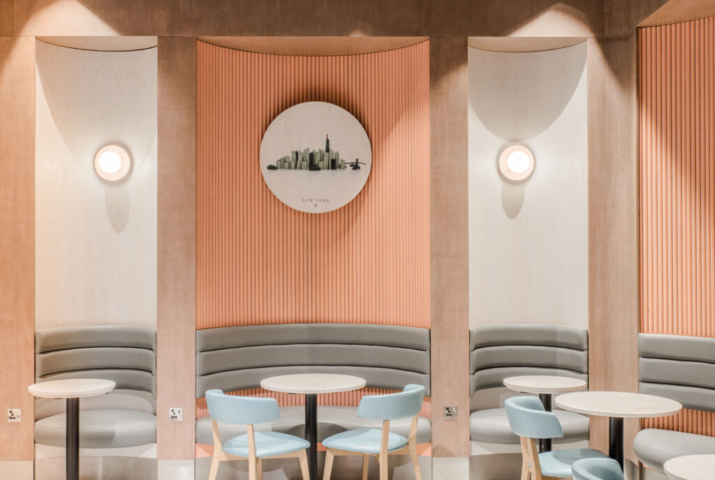
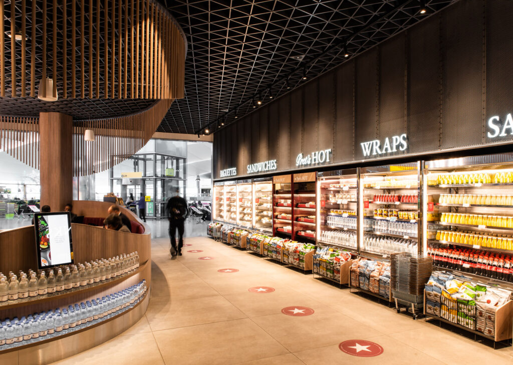
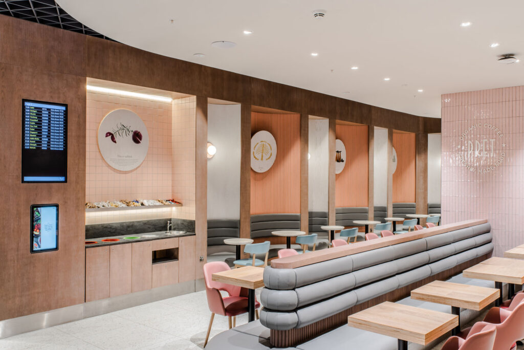
The shop sits as a pair of components. A forecourt with raw metal wall finishes and monolithic flooring with langers and tills at opposing ends, enclosing curved timber feature seating to accommodate a quick bite before a flight. A dropped bulkhead defines the fluted seating area designed for the longer-stay travellers. Sinuous banquettes washed in a pastel colour palette line the perimeter of this space to provide more privacy for individuals and groups. Pret’s iconic passion graphics depict scenes from global cityscapes and a feature column roundel maintains brand identity in a new look, Pret Design.

Publisher of Hospitality and Leisure News, 365 Retail, Retail Source and organiser of the Creative Retail Awards.


